Spec - Part I: The Basics
Last updated: March 2019
Introduction
 Spec is a UI library for Pharo Smalltalk. Well, to be more precise, Spec is a library for describing UI elements, their properties and their behaviour. Under the hood the output of Spec is fed into a UI framework like Polymorph to draw the widgets on the screen.
In this series of tutorial episodes, you will understand its concepts and learn how to use it for your everyday UI programming requirements.
Prerequisites
For this series we will use Pharo 7.0 (the latest stable version at the time of writing this) and since Spec is already included in Pharo 7.0, you don't need to do anything. Just create a package to put in all the classes that we create -- let's assumeMy-Spec-Tutorial as the name. The First Window
Windows are the primary containers for other widgets in Spec. Creating and showing a window is simple.Create a new class named
MyFirstWindow with the following definition: ComposablePresenter subclass: #MyFirstWindow
instanceVariableNames: ''
classVariableNames: ''
package: 'My-Spec-Tutorial'JFrame), ComposablePresenter has been sub-classed.As Spec is, obviously, about UI specification, naturally the next step is to provide the specifications. Override the class-side method
defaultSpec which basically tells Spec about UI specifications: defaultSpec
^ SpecLayout composed.The last step is to override the instance-side method
initializeWidgets which later we will use to initialize the widgets in our window. But for now the method doesn't do anything: initializeWidgets
"Empty method"MyFirstWindow new openWithSpec and voila! The Legend
Almost all computer programming books and tutorial start with the legendary "Hello, world" example -- who I am to break this holy ritual? Let's make our dull window greet the universe. All that is needed is adding a label widget to our container.First, the label; Spec interacts with widgets using instance variables and their accessors. So, modify the class definition and add a variable named
labelGreeting to it. ComposablePresenter subclass: #MyFirstWindow
instanceVariableNames: 'labelGreeting'
classVariableNames: ''
package: 'My-Spec-Tutorial'Now generate the accessors for
labelGreeting. Remember, you don't need to write the accessors yourself; just right-click on the class and from the menu select Generate Accessors.Time to initialise the label with the message of legends. As you may have guessed,
initializeWidgets needs to be modified: initializeWidgets
self instantiateModels: #(
labelGreeting LabelPresenter
).
labelGreeting label: 'Hello, world'.LabelPresenter to it. On line 5, label value is set.And finally,
labelGreeting should be added to our window. Like many other UI frameworks (e.g. Swing), widgets are not directly added to the container. Rather they are added to a "layout" which is, in turn, attached to the container. Same philosophy here. Editing the layout is done in the class-side method defaultSpec, recall? defaultSpec
^ SpecColumnLayout new
add: #labelGreeting;
yourself.SpecColumnLayout which, as the name suggests, lays out the widgets in a stack of rows.Now run
MyFirstWindow new openWithSpec and behold the dawn of programming! I Salute You!
As magnificent as your window is, it will probably get boring after a few runs to see the same message. Let's refactor our program so that it accepts a name from the user and greets that name.Widgets
The greeter needs 3 widgets: a label (which is already there), a text input field and a button. As you can recall, the first step is to define instance variables for each widget:ComposablePresenter subclass: #MyFirstWindow
instanceVariableNames: 'labelGreeting textName buttonGreet'
classVariableNames: ''
package: 'My-Spec-Tutorial'The next step is to modify the spec to match the simplistic design:
defaultSpec
  ^ SpecColumnLayout new
      add: #labelGreeting;
      add: #textName;
      add: #buttonGreet;
yourself.initializeWidgets
self instantiateModels: #(
labelGreeting LabelPresenter
textName TextInputFieldPresenter
buttonGreet ButtonPresenter
).
labelGreeting text: ''.
textName autoAccept: true.
buttonGreet label: 'Greet Me!'; disable.CTRL+S). And on line 9, the label for button is set and the button is disabled as it will become enabled only when there is at least one character in the text field.If you run the program, you can see how Spec has added widgets to the display and how their initial values and properties are set.
Let's See Some Action!
Right now, the greeter doesn't do anything; it just shows up. We need to tell spec when to do what: when to enable the button and when and with what to update the label. Wiring up actions and action/event handlers is done with overridinginitializePresenter method. initializePresenter
textName whenTextChanged: [
buttonGreet enable ].
buttonGreet action: [
labelGreeting label: 'Hello, ', textName text, '!'.
buttonGreet disable. ]buttonGreet when the text in textName changes. On line 4, 5 and 6, it is told to change the value of labelGreeting upon activating buttonGreet and then disable buttonGreet so that nobody gets a double greeting!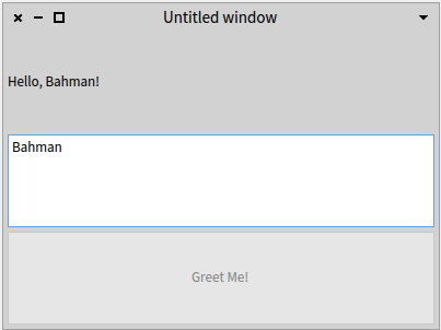 |
| Figure 1 - Greeter version 1 |
Where's The Title?
One of the things that discriminates our greeter from a professional one is that it lacks the user's title in the greeting message. To achieve this, we add 3 radio buttons for the common titles Mr., Mrs., and Ms. to the greeter.As usual, first we add the instance variables:
ComposablePresenter subclass: #MyFirstWindow
  instanceVariableNames: 'labelGreeting textName buttonGreet radioMr radioMrs radioMs'
  classVariableNames: ''
package: 'My-Spec-Tutorial'As you may have guessed by now, the next step is to instantiate the radio buttons:
initializeWidgets
  self instantiateModels: #(
    labelGreeting LabelPresenter
    textName      TextInputFieldPresenter
    buttonGreet   ButtonPresenter
    radioMr       RadioButtonPresenter
    radioMrs      RadioButtonPresenter
    radioMs       RadioButtonPresenter
  ).
  labelGreeting label: ''.
  textName autoAccept: true.
  buttonGreet label: 'Greet Me!'; disable.
self setupTitleRadioButtons.initializeWidgets, on line 13, further radio buttons setup is done in setupTitleRadioButtons: setupTitleRadioButtons
radioMr label: 'Mr.'.
radioMs label: 'Ms.'.
radioMrs label: 'Mrs.'.
RadioButtonGroup new
addRadioButton: radioMr;
addRadioButton: radioMs;
addRadioButton: radioMrs;
default: radioMr.RadioButtonGroup, add all the radio buttons to it and set the default one. RadioButtonGroup is not a widget, it's a utility class that keeps track of its radio buttons in a Collection and enables/disables them when one is activated.Next step, as you already know, is telling Spec what to show:
defaultSpec
  ^ SpecColumnLayout new
      add: #labelGreeting;
      add: #textName;
      add: #buttonGreet;
      add: #radioMr;
      add: #radioMrs;
      add: #radioMs;
yourself.buttonGreet should be modified to take that into account. initializePresenter
textName whenTextChanged: [
buttonGreet enable ].
buttonGreet action: [
labelGreeting label: 'Hello, ', self userTitle, ' ', textName text, '!'.
buttonGreet disable. ]userTitle on line 5. userTitle
"Find out user's title by checking the radio buttons."
radioMr state
ifTrue: [ ^ radioMr label ]
ifFalse: [
radioMrs state
ifTrue: [ ^ radioMrs label ]
ifFalse: [ ^ radioMs label ] ]. |
| Figure 2 - Greeter version 2 |
What Next?
So far we have developed a fully functional greeter. However, as you certainly have noticed, it's very ugly! Worry not as in the next episode (Spec - Part II - The Layout), we will look at layouts and widget positioning in Spec.Image source: theburlingtonhomeinspector.com
Comments
Post a Comment